2013.06.30
KAYAC’s new logo (CI) – Three essential factors of fun-loving logo that changes infinitely [INTERVIEW]
Hello, everyone.
I would like to introduce to you our new CI (logo) launched along with the release of KAYAC’s revamped corporate website on July 1.
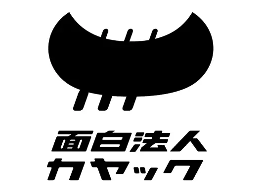
The new design that celebrates our 15th anniversary milestone is amusing and makes you chuckle.
KAYAC’s CI, which is the face of our company, was created in a loose manner and had its own wings. It had been used so loosely that any employ was able to freely make slight changes to it.
It may be very KAYAC-like in a way.
But the revamped logo is somewhat different.
It must be the representation of our determination to proceed to the new stage beyond ambiguous and free excitement (we guess…).
Well, I’ll explain each of the three essential factors of our new CI.
The first factor is that employees can customize the oar in the KAYAC mark.
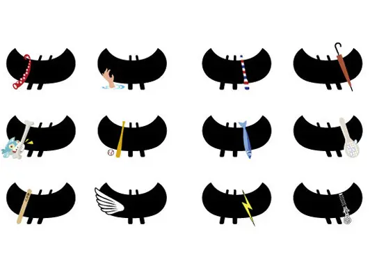
Because KAYAC was founded by three members, the logo mark has a kayak with three oars.
Now, employees can make changes to one of the three oars.
An employee who creates baseball games could change it to a baseball bat. A copywriter could change it to a pencil; a person who is involved in restaurant business could change it to a ladle; and so on.
Employees can choose any item they want. It shows their “face at KAYAC” on their business cards.
All the employees will reflect on their tasks and personality.
And then they choose something and make changes to the logo.
This also represents that each one of us employees oars KAYAC.
The customized oar shows each employee’s personality to our partners and serves as a device to communicate our philosophy of “creating and connecting” through fun-loving business.
The second factor is that oars on the kayak can be illustrated in three different directions, right, center, and left.
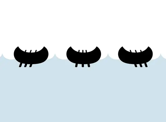
KAYAC has worked on many digital promotional services, and this shows our spirit of actively seeking changes without being afraid of them.
It seems we can proceed to any direction.
Representative Daisuke Yanasawa says that the shape was created based on a digital-oriented idea.
Please visit our corporate site if you have a device on which you can see websites.
You will find our logo with oars that move from side to side.
It is a rare scheme for 2D, but KAYAC is familiar with this type of depiction because we create many digital banners.
It represents the movement of the oars on a plane surface.
The third factor is the employment of the corporate name in katakana and its font.
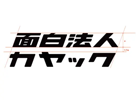
This reinforces our manga- and anime-oriented spirit.
We have employed a simple and light shape with sharp lines and edges.
The design was completed by all the members of the design team led by Tomoya Sasaki and Daisuke Yamashita.
Based on the conventional design, we evolved the logo design into the one that has never existed and that is not similar to anything, by showing our position as a Japanese content production company and by adding a sense of speed inspired by manga to depict business speed, as well as some cute and lovable character.
Many people who have met KAYAC employees may have an impression that KAYAC is a company with manga business cards.
Our revamped CI will add another factor to it.
The new design has an amusing essence that makes people feel that they just don’t want to take a pass on KAYAC.
We hope you enjoy it!
 Facebook page
 Official X account
 CEO Yanasawa’s X account